
MSME
Registered

Wedline
Registered

We Deliver
Clutch

28+ Reviews

250+ Projects
Completed

125+ Happy
Clients
MSME
Registered
Wedline
Registered
We Deliver
Clutch
28+ Reviews
250+ Projects
Completed
125+ Happy
Clients
In the field of website creation, responsive design has become a vital component of successful and user-friendly websites, especially within the WordPress ecosystem. It's more crucial than ever to make sure your WordPress website is responsive due to the rapid increase in the use of mobile devices. Let's explore the benefits of responsive design for WordPress websites and how it affects user experience, search engine optimization, and the success of your website as a whole.
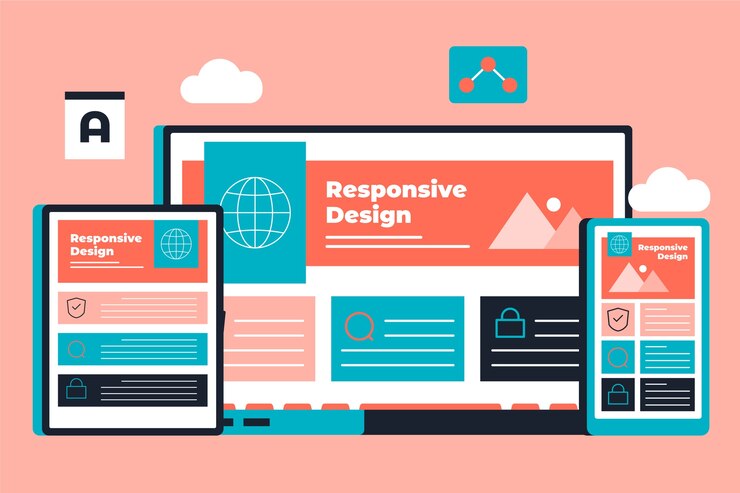
A web development technique known as responsive design seeks to build websites that offer the best possible reading and interacting experiences on a variety of devices and screen sizes. This covers tablets, cellphones, laptops, and desktop computers. A WordPress website that is responsive modifies its design, content, and functionality automatically according to the device that is accessing it.
Improving user experience (UX) is one of responsive design's main advantages. Users are more likely to stay interested and peruse your material when they can simply navigate and interact with your website on any device. A WordPress website that is responsive makes sure that users can obtain information easily, which increases user happiness and decreases bounce rates.
One important component of search engine optimization (SEO) is responsive design. Mobile-friendly websites are given preference in search results by search engines like Google, especially for users conducting searches on mobile devices. A responsive WordPress website will help your search engine optimization (SEO) efforts by increasing the exposure and rankings of your website in search engine results pages (SERPs).
Websites must adjust to various screen sizes and resolutions because to the wide variety of devices used to access the internet today, including smartphones, tablets, and desktop computers. Your WordPress website may appear and work flawlessly on all platforms thanks to responsive design, providing a unified brand experience.
Faster page loads are frequently the result of responsive design, especially on mobile devices. Because mobile users want websites to load quickly, this is important. You can lower bounce rates and increase user retention by making your WordPress website more responsive. This will eventually increase conversion rates and enhance overall performance.
It is imperative for WordPress website development and wordpress website development company businesses to integrate responsive design into their projects. Customers want their websites to function properly on all devices, and responsive design is the cornerstone for fulfilling this demand. Responsive design is important, and a trustworthy WordPress website development firm prioritizes it in every project.
Companies that build educational software can also gain a great deal from responsive design concepts. It is crucial to make sure that educational websites and platforms are available on all devices as more and more services and material are provided online. On computers, tablets, and cellphones, educators, parents, and students should be able to interact with instructional materials without difficulty.
The term "responsive design" describes a web development methodology that enables websites to adjust and react to various screen sizes and devices, giving users the best possible viewing experience. Whether accessed from a desktop, tablet, or smartphone, a responsive WordPress website instantly modifies its design, content, and functionality to fit the screen size of the device.
By embracing responsive design principles and implementing best practices, WordPress website developers can create engaging and accessible websites that drive results for their clients. Education software developers can enhance the accessibility and usability of educational platforms, ultimately enriching the learning experience for students and educators alike.

Posted On: 07-Jun-2024
Category:
We serve globally
